Reimagining Out of Eden Walk
#Interactive Storytelling #Visual Journalism #UX Research #UX Design #National Geographic
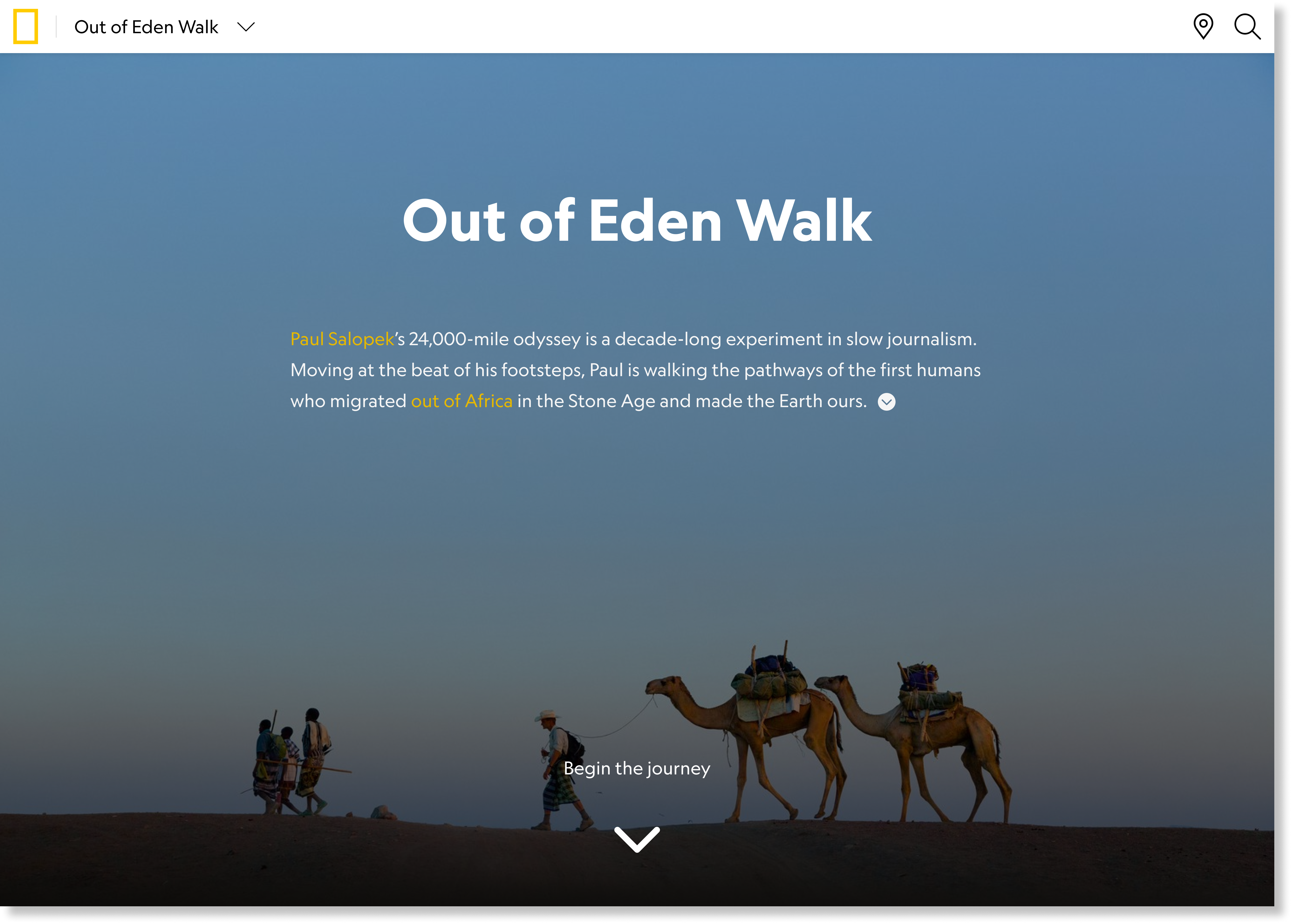
“Out of Eden Walk (OOEW) is a years-long journalistic expedition through which National Geographic Fellow Paul Salopek is walking the globe, retracing the pathways of human origins from Africa to South America. This 24,000 mile odyssey is an exercise in slow journalism, allowing Paul to report the major stories of our time holistically by slowing down to walking speed to share the full context and voices of local people behind the headlines. Paul’s words, as well as his photographs, video, and audio, are creating a global record of human life at the start of a new millennium.”
OOEW is National Geographic‘s longest standing project with a global following and has a legacy of followers from other platforms like Reddit. The project continues and has many years to go, but the current website, pioneering when built, runs on an outdated platform.
During my internship at National Geographic Society, I reimagined the OOEW website with more current storytelling and interaction approaches using UX research and design methodologies.
During my internship at National Geographic Society, I reimagined the OOEW website with more current storytelling and interaction approaches using UX research and design methodologies.
Timeline
Tools
Collaboraters
- Internship Period: June - August 2023
Tools
- Design & Prototyping: Figma, Procreate
- Web Analytics: Heap
Collaboraters
- Project Manager
- Stakeholders
- Content Editors/Managers
My Role:
- Research: Conducted stakeholder interviews to gather project requirements and insights; Performed comparative analysis to evaluate design approaches and best practices.
- Design & Prototyping: Created iterative designs based on feedback; Developed interactive prototypes to visualize design solutions
- Final Work Share-out: Presented and shared final work with stakeholders, including the CEO, to gather feedback and ensure alignment.
00. Final Work Preview
01. Identifying Opportunities
a. Contextual AnalysisI began the research process by analyzing program-related documents to gain a comprehensive understanding of the context. This involved reviewing background information, goals, and existing frameworks associated with the OOEW project. By extracting key terms and themes from these documents, I established a foundational understanding of the project's scope and identified several initial considerations for the UX design phase. This preliminary assessment served as a guiding framework, helping to shape design decisions and focus on critical areas that would enhance user experience.
![]()
![]()
.
![]()
b. Stakeholder Interviews
To further inform the design process, I engaged with 7 stakeholders through a series of interviews, including Paul Salopek, who initiated the OOEW project, his content editors, National Geographic Storytelling Program Managers, Product Manager, etc.
![]()
![]()
![]()
Their input was crucial for refining the identified priorities, ensuring that the UX design aligned with both user needs and stakeholder expectations. Among the various valuable insights gathered, the following were identified as the most critical:


.

b. Stakeholder Interviews
To further inform the design process, I engaged with 7 stakeholders through a series of interviews, including Paul Salopek, who initiated the OOEW project, his content editors, National Geographic Storytelling Program Managers, Product Manager, etc.
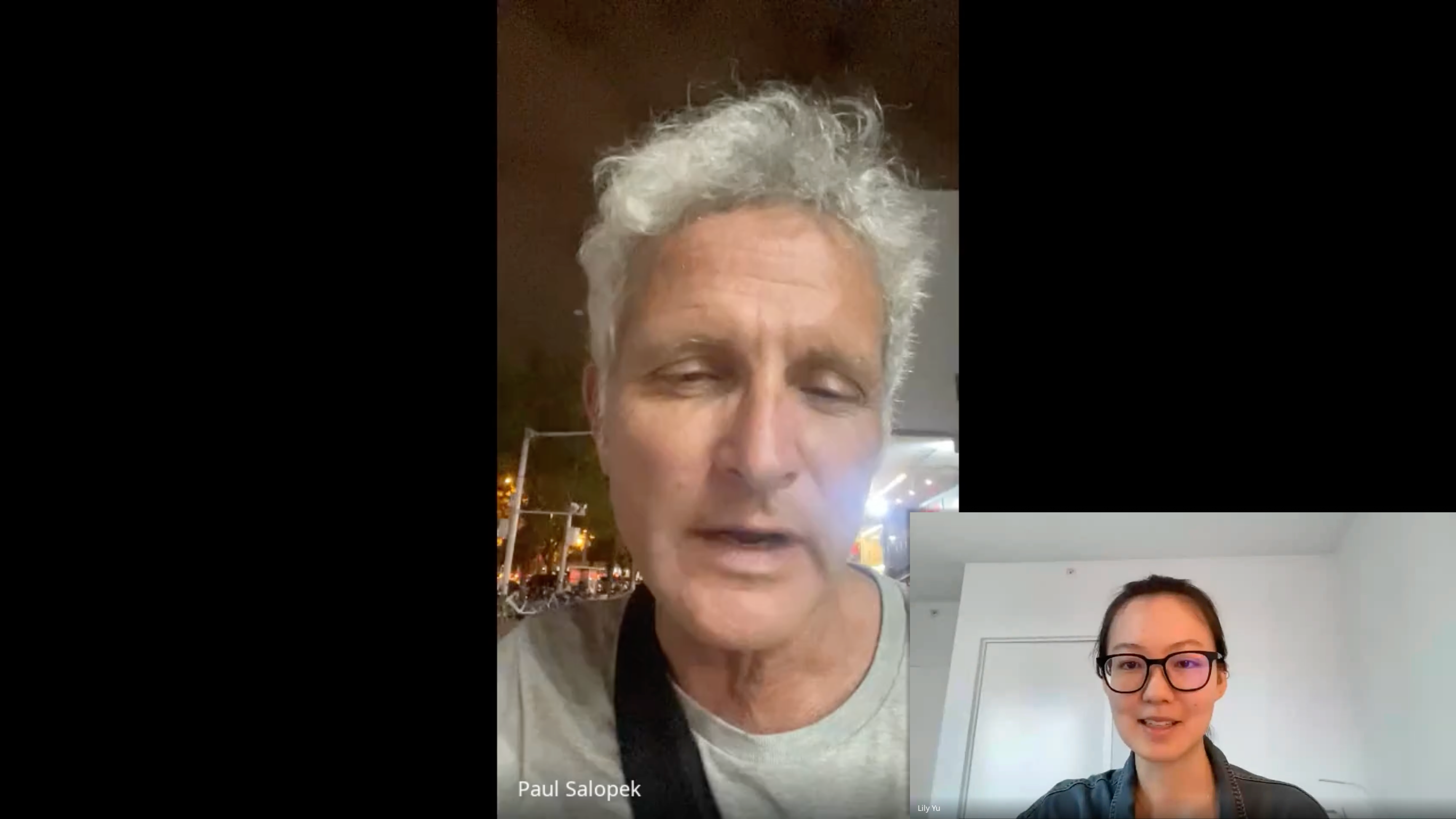

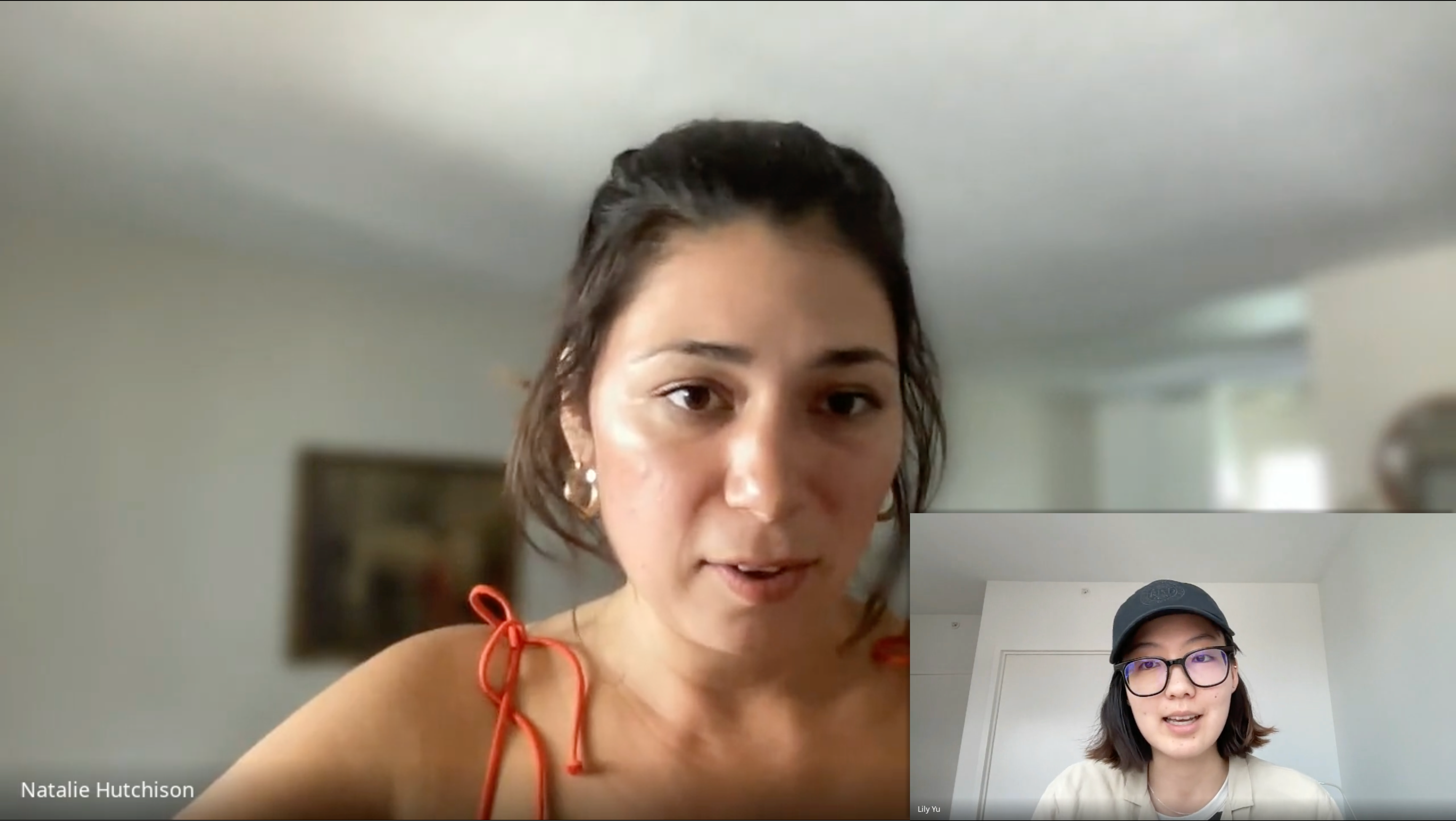
Their input was crucial for refining the identified priorities, ensuring that the UX design aligned with both user needs and stakeholder expectations. Among the various valuable insights gathered, the following were identified as the most critical:

The platform should be crafted to deeply enhance storytelling, creating immersive and emotionally engaging experiences that captivate and resonate with users.
.

It’s essential for the platform to function as a comprehensive digital repository, facilitating the efficient organization and retrieval of diverse information.

The design should support a broad range of data formats, enabling the effective integration of geo-spatial data, audio recordings, and other multimedia elements to enrich the user experience.
c. Site Analysis I conducted a thorough site analysis. This involved evaluating the current site architecture, user interactions, and navigation flows to identify existing challenges and opportunities for improvement.
![]()
![]()
![]()
![]()
Major Findings
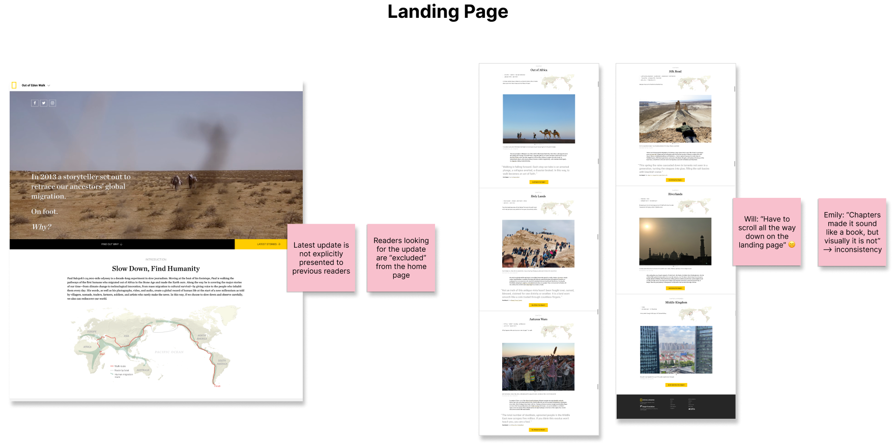
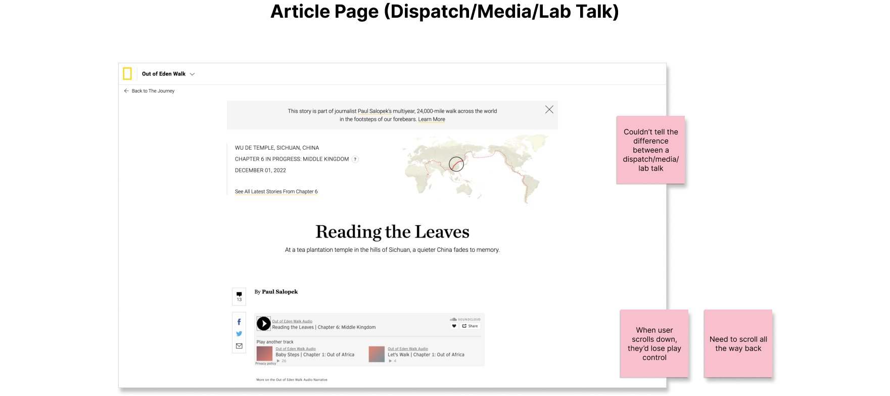
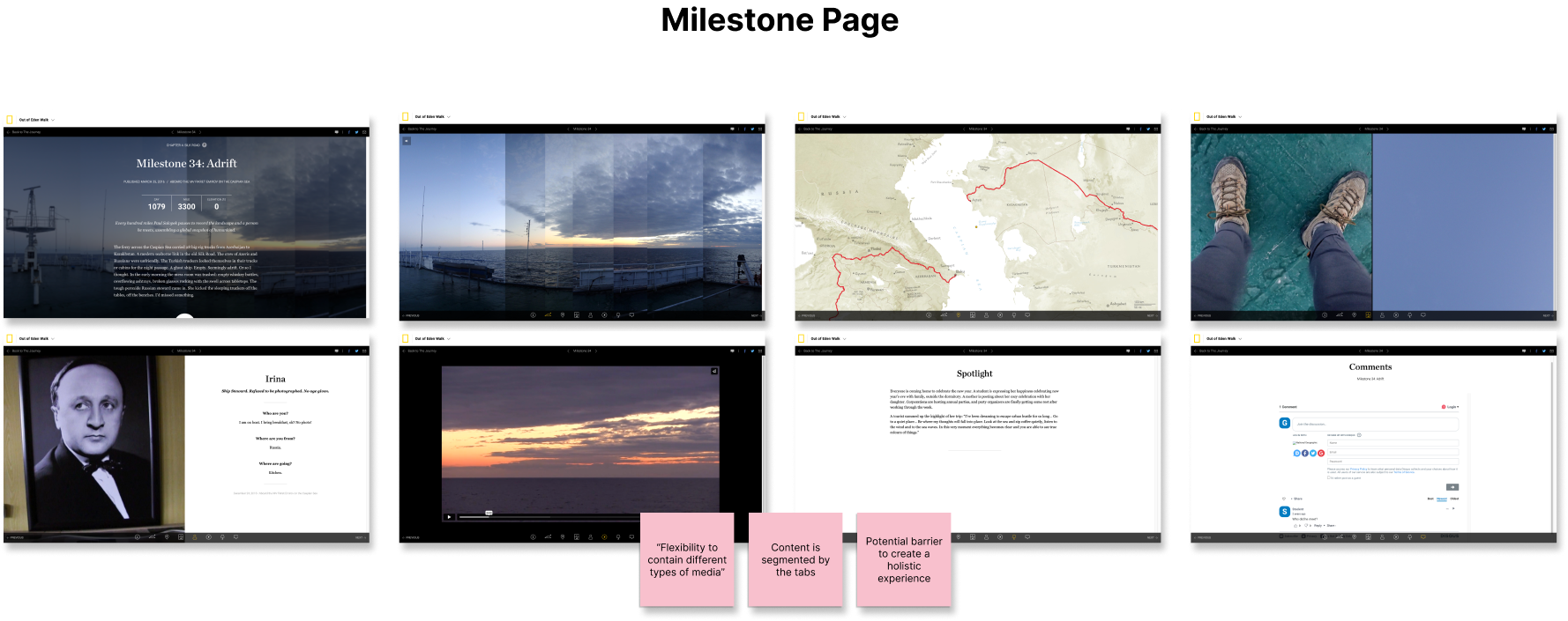
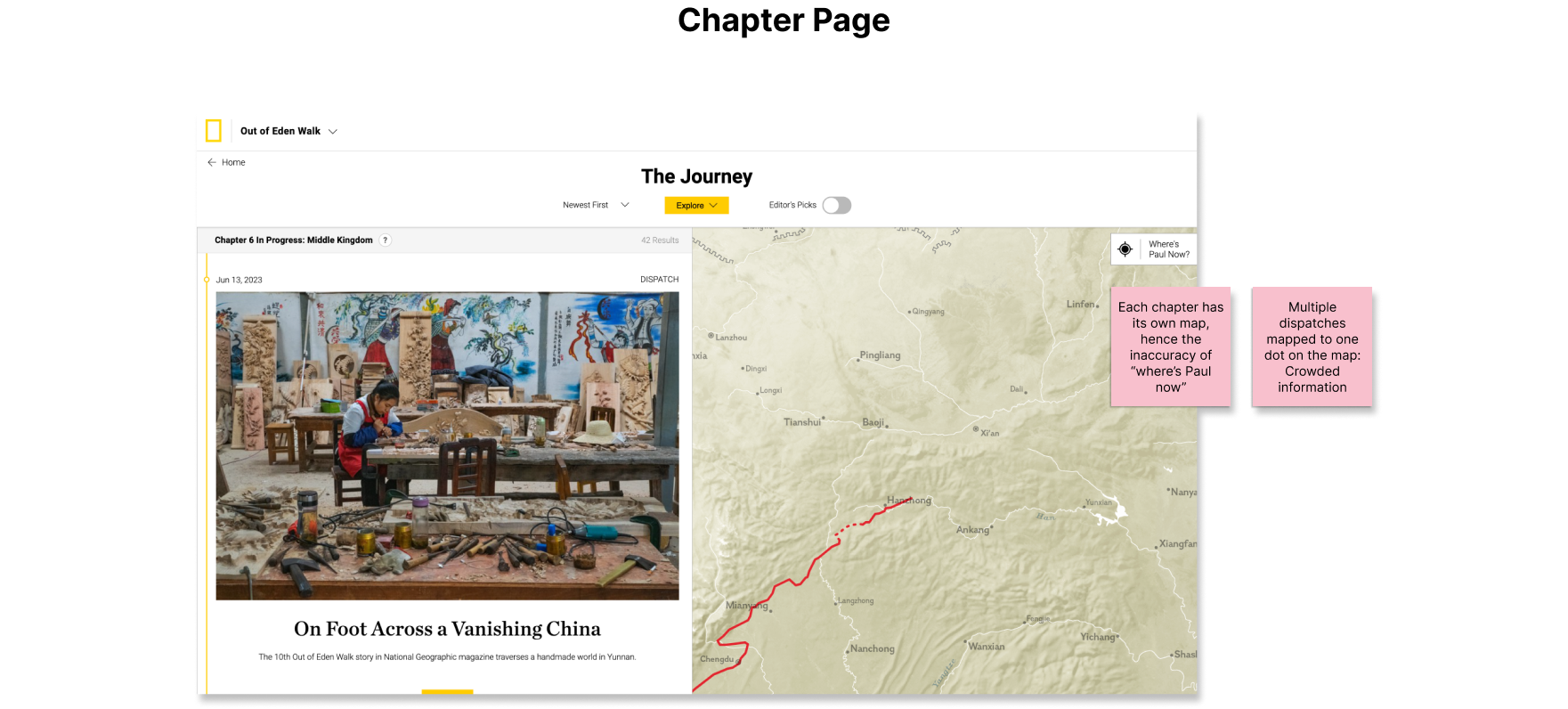
Major Findings
- Linear Storytelling Approach
The current design follows a straightforward, linear storytelling path, which may limit narrative flexibility and user engagement.
- Complex Information Architecture
The existing structure is intricate and convoluted, presenting challenges for users in navigating and accessing information efficiently.
d. Comparative Analysis
I conducted a comparative analysis by reviewing reference websites to identify trends, approaches, and patterns for interactive storytelling in journalism. This helped to refine strategies for organizing assets and designing interaction patterns that enhance the storytelling experience on the OOEW website. This analysis provided insights into best practices and innovative approaches to elevate user engagement and narrative effectiveness.
![Selected Comparators]()
Comparator Selection Criteria
Selected comparator websites are web-based interactive storytelling projects that:- Come from a strong brand for digital journalism
- Cover various types of media and data, including images, video, audio, geo-spatial data, time-series data, etc.
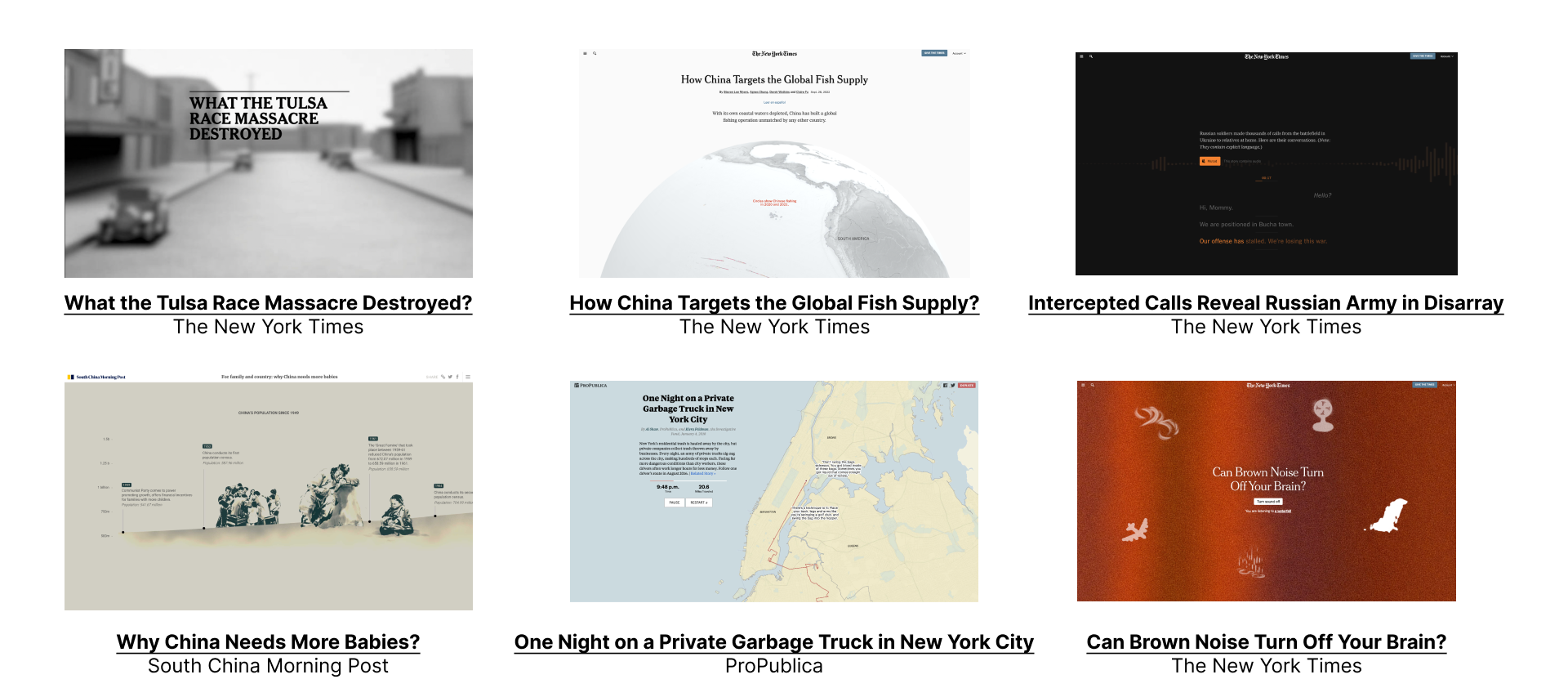
Major Findings 💡
- “Scrollytelling” as the main interaction approach
Immersive while allow for user-led non-linear navigation
- Qualitative visual explainers to break down events chronologically and geographically
Situate audience in the context
02. Research-based Design Insights
a. Design Goals
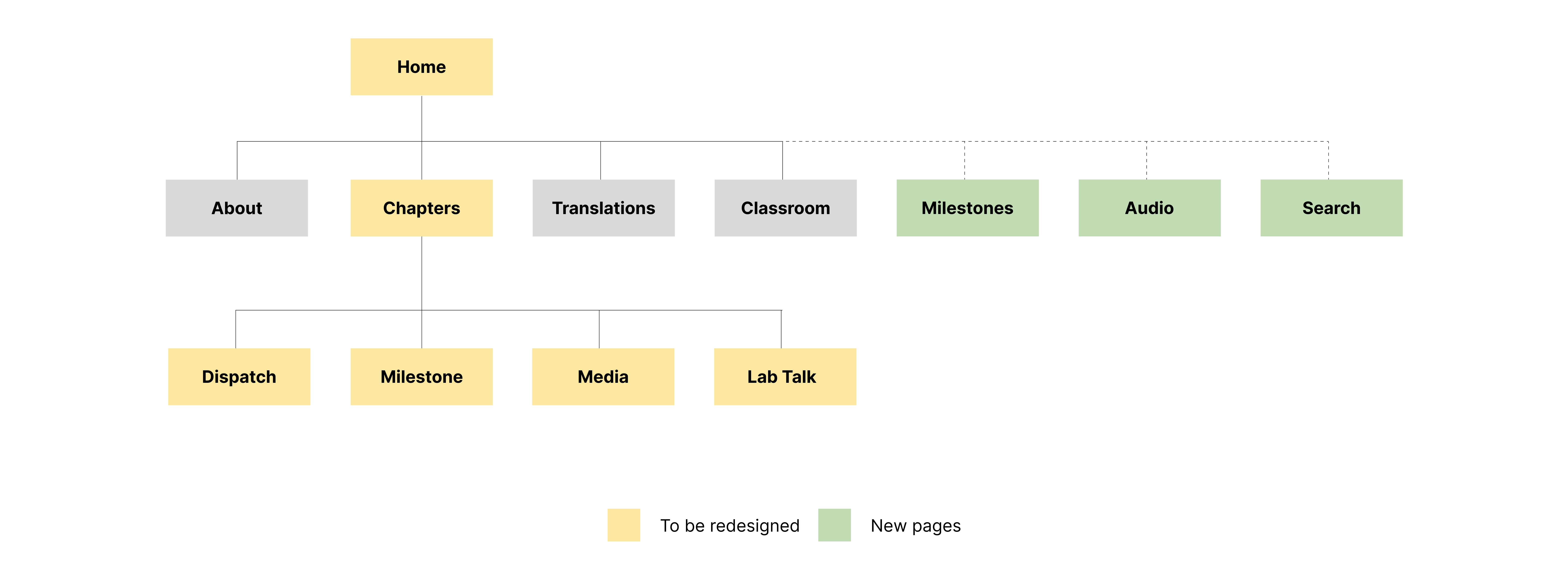
b. Proposed Architecture
![]()
- Utilize “scrollytelling” to improve navigation
- Enhance the integrations of various media/data types
- Apply geo-spatial data with cartography to contextualize the narrative
b. Proposed Architecture
03. Design Studio
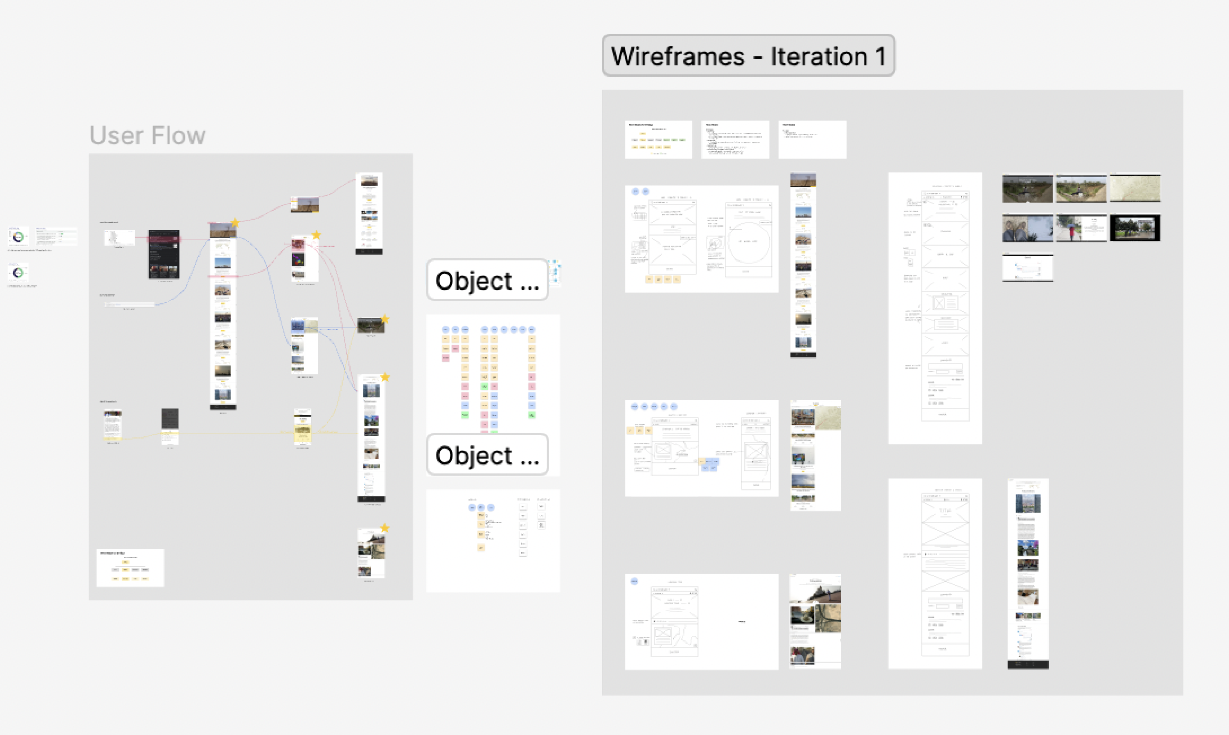
a. Wireframing
During this stage, I made two iterations of wireframes based on the feedback from stakeholders.
![First Iteration]()
![Second Iteration]()
Summarized Feedback from Stakeholders
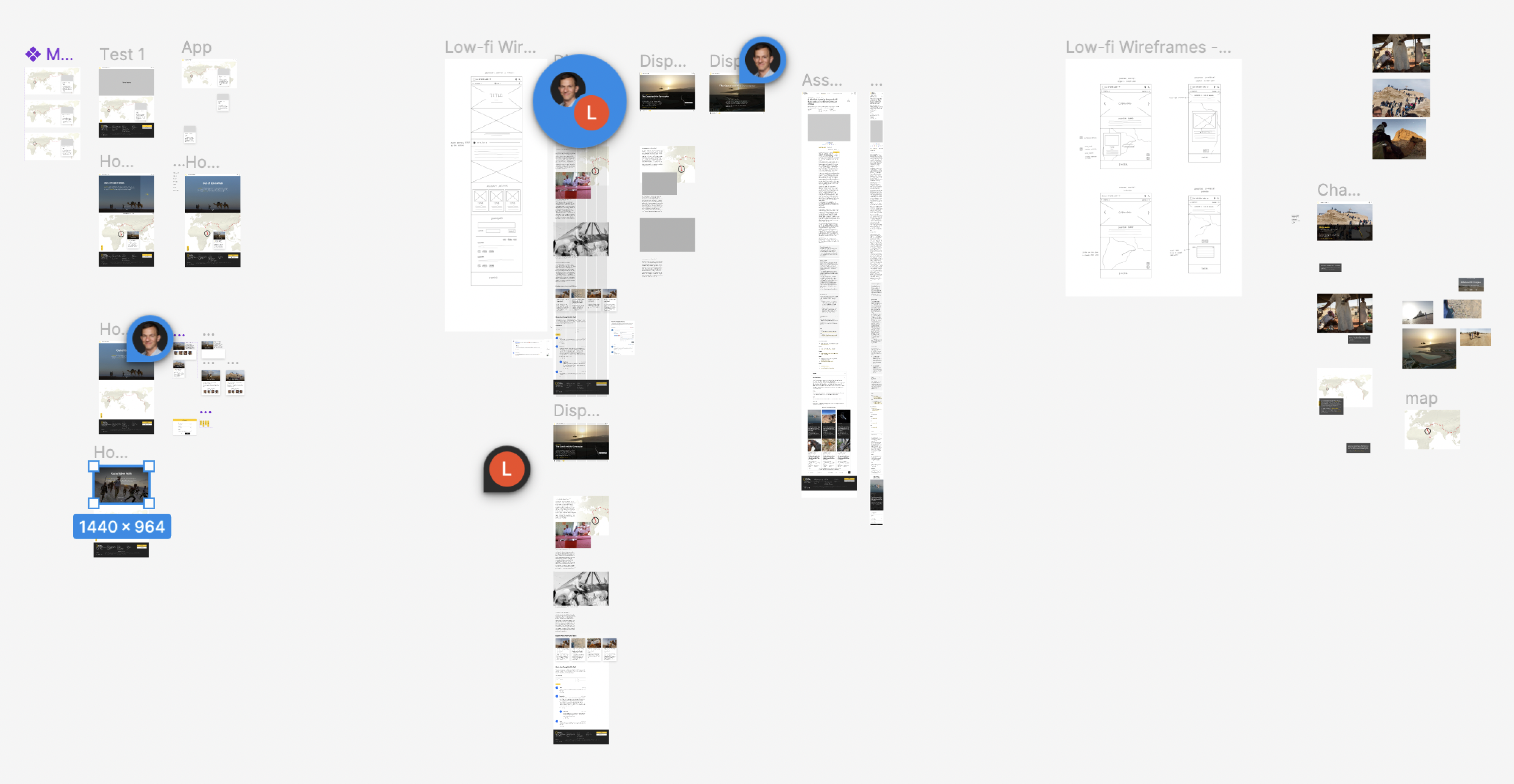
b. Prototyping
![Prototyping in Figma]()
During this stage, I made two iterations of wireframes based on the feedback from stakeholders.

- Improve post discoverability
- Highlight human elements in the story
- Strengthen connections between posts
- Enhance connections between assets
b. Prototyping
Integrating all the feedback that I received from the two iterations of wireframes, I developed a final prototype.
.
.
04. Final Work
.
05. Some Design Decisions
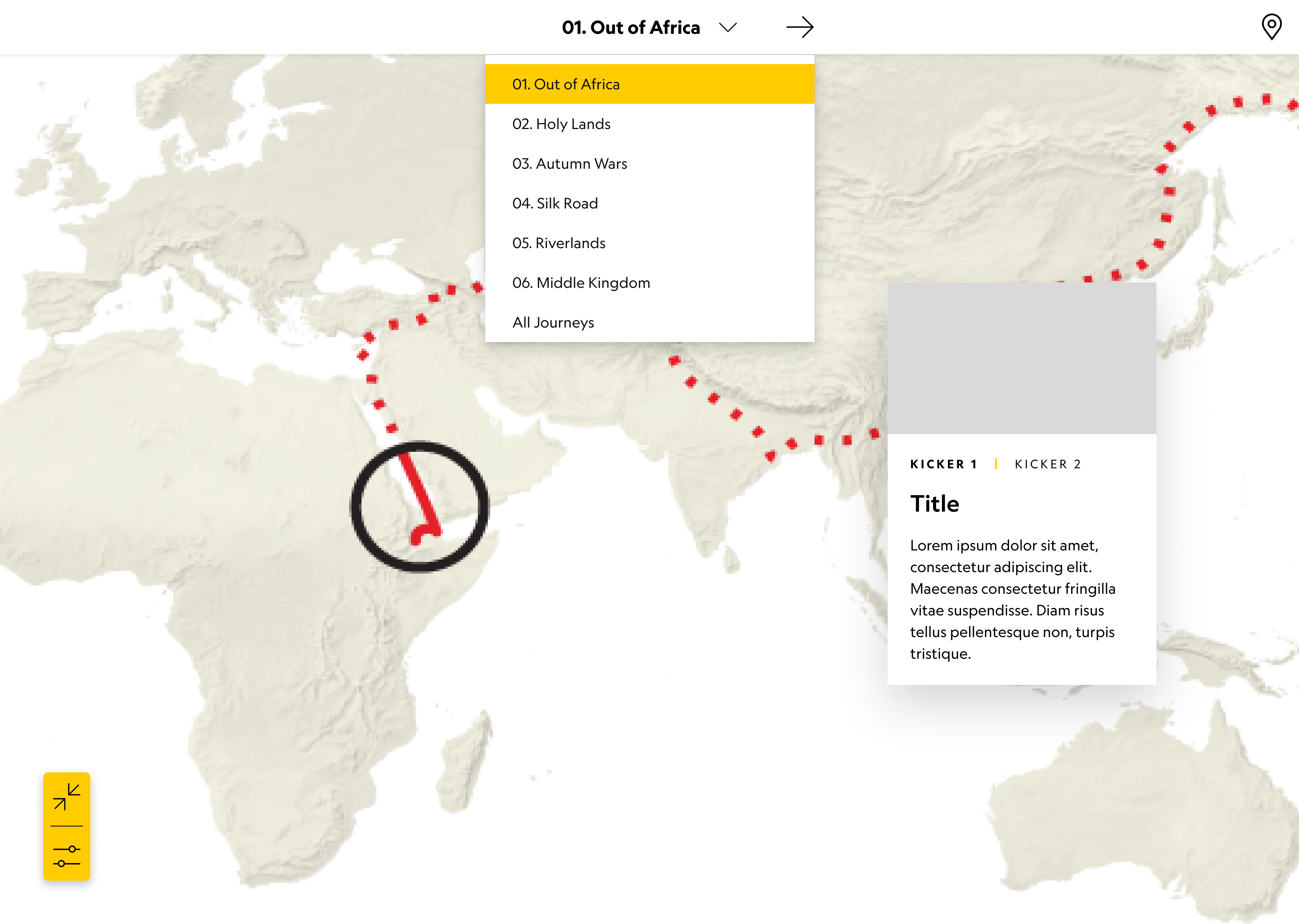
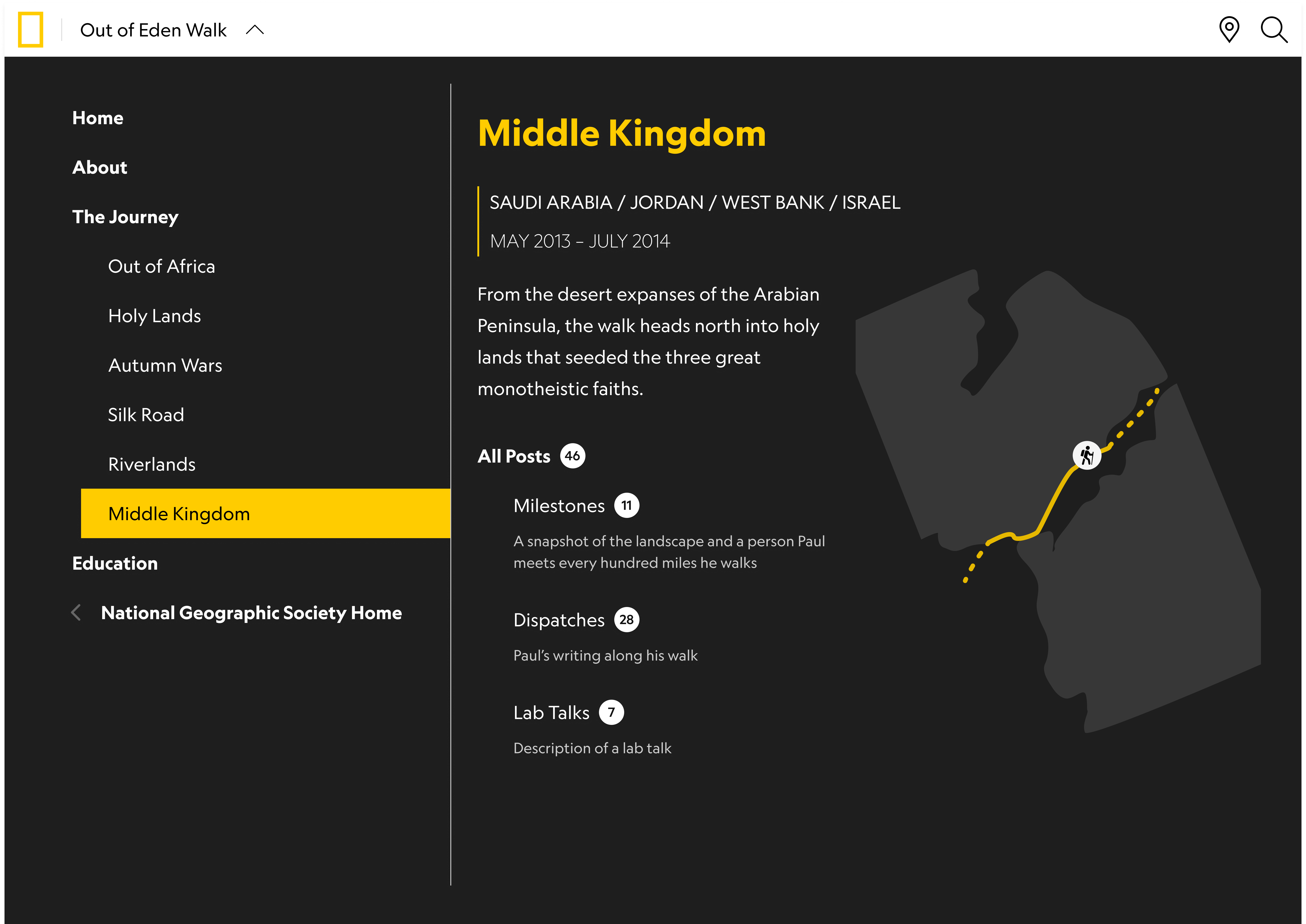
“Super Nav”Originally, I followed the current site’s approach of using a dropdown menu with chapter names for navigation. However, inspired by stakeholder feedback emphasizing a need for more contextual and holistic journey insights, I developed a "super nav." This navigation feature offers readers a comprehensive overview of each journey segment, integrating time, location data, and post categories to enhance user understanding and engagement.
![Original Dropdown Menu]()
![New Design for Navigation: "Super Nav"]()
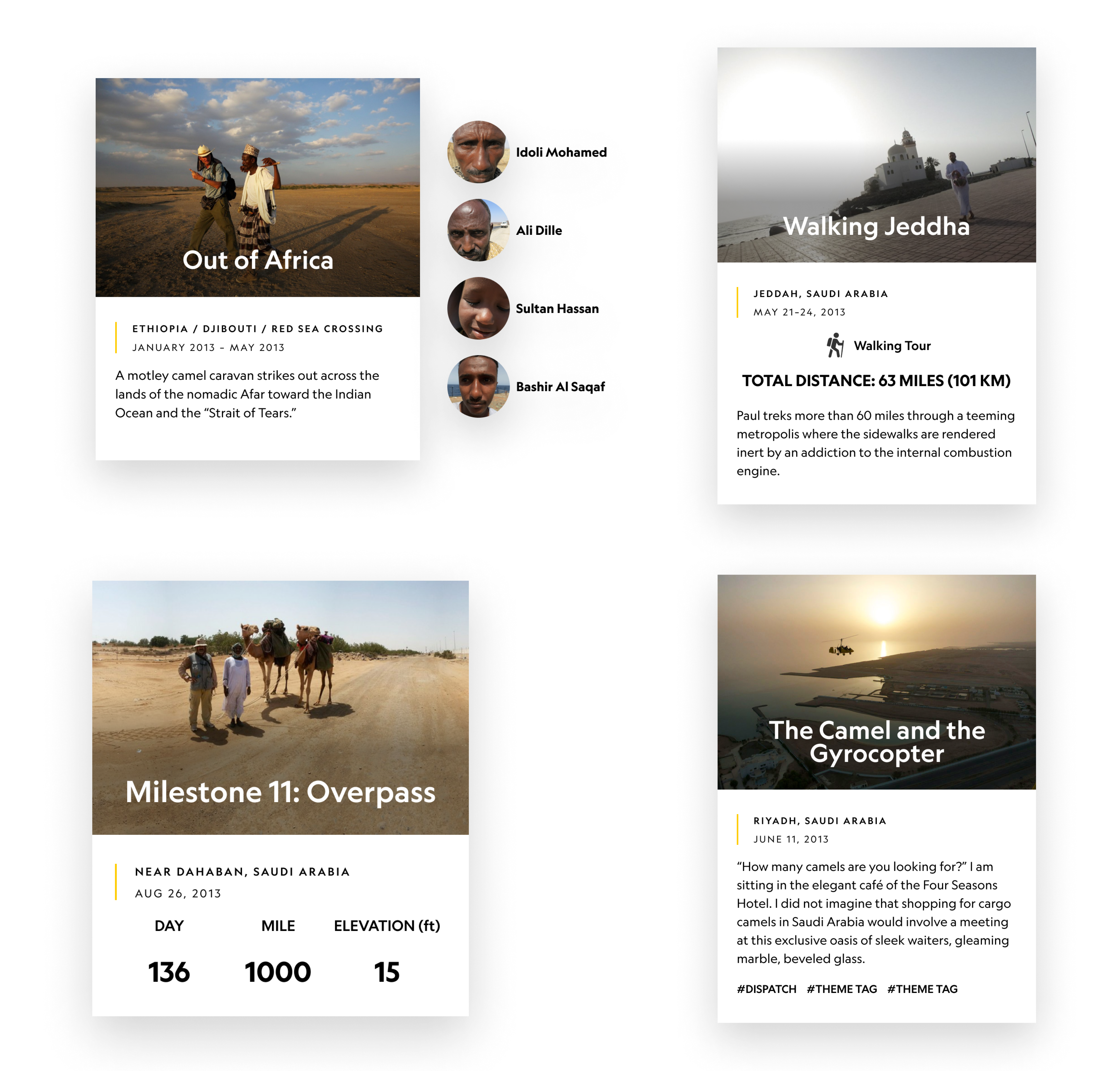
Cards
The initial iteration of post cards is shown on the left below. In the final version, I opted for circular frames for people's images, positioned alongside each card. This design decision aimed to emphasize the human elements of the story. Following Object-Oriented UX principles, which discourage masked objects (where different objects serve distinct purposes), I ensured that each design element was distinct. This approach allowed for a focused presentation of metadata associated with posts across different categories.
![First Iteration]()
![Final Design for Different Types of Posts]()
Cards
The initial iteration of post cards is shown on the left below. In the final version, I opted for circular frames for people's images, positioned alongside each card. This design decision aimed to emphasize the human elements of the story. Following Object-Oriented UX principles, which discourage masked objects (where different objects serve distinct purposes), I ensured that each design element was distinct. This approach allowed for a focused presentation of metadata associated with posts across different categories.

06. Areas for Growth
Due to time constraints, I have several unresolved questions and design goals for further exploration:
User Research Questions
Design Goals
User Research Questions
- Do users who enter sideways get a full picture of the journey?
- How is the human element perceived?
- What do users consider as the story’s focal point?
Design Goals
- Create an "About" page to unify all OOEW resources.
- Refine navigation with additional iterations.
- Develop tooltips and explainers for contextual onboarding.
- Enhance search UI with recommended keywords and filters.
- Implement read/unread states for posts to help readers get the latest updates.
- Improve accessibility for mobile and low-bandwidth users.
Acknowledgements
Thanks to Luke Miller, Pauline Munga, Mary Finer, the UX Team, the Constituent Products Team from National Geographic Society for the guidance and support.
Thanks to Paul Salopek, Julia Payne and Ollie Payne from the OOEW Editorial Team, stakeholders from National Geographic Society‘s Storytelling Programs, Content and Editorial Strategy, Strategic Communications, and Mapping for the insights and feedback.
Thanks to Paul Salopek, Julia Payne and Ollie Payne from the OOEW Editorial Team, stakeholders from National Geographic Society‘s Storytelling Programs, Content and Editorial Strategy, Strategic Communications, and Mapping for the insights and feedback.